Pepsi has a new logo
By Danielle Wiener-Bronner, CNNUpdated 11:22 AM EDT, Tue March 28, 2023
Source: CNN Business
New York CNN —
If someone were to ask you to draw the Pepsi logo from memory, what would you draw? A circle, perhaps, with the red, white and blue stripes that are emblematic of the brand. The word “Pepsi,” probably, in that globe.
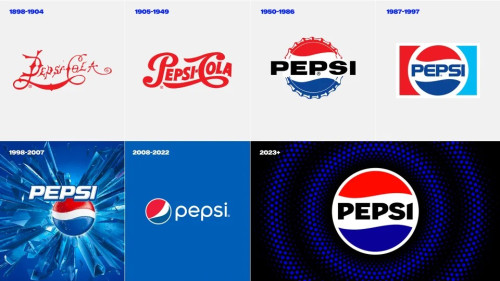
When PepsiCo walks people through this exercise, as it sometimes does, that’s what most do: They put the word “Pepsi” in the circle. But that’s not how the current logo actually looks. The brand name is off to the side, a bit meek next to the iconic globe. So Pepsi is making a change.
“We couldn’t ignore that kind of insight,” Mauro Porcini, PepsiCo’s chief design officer, told CNN. “Instead of rejecting it, we decided to embrace it.”
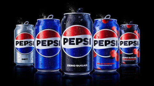
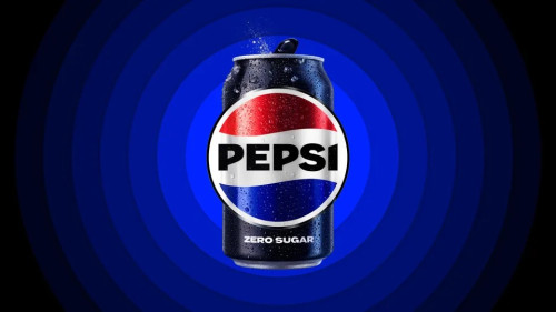
Pepsi on Tuesday unveiled a new logo and branding that will roll out in North America this fall and globally next year. It looks a lot like the 1990s version which seems to have stuck in people’s brain, but with new elements to make it more modern, including a different font and font color and a new border. The changes are designed not only to better align with people’s recollection, but to draw attention to Pepsi’s zero sugar line — a key part of the company’s growth plan.


https://edition.cnn.com/2023/03/28/business...logo/index.html


